
Book cover designs as inspo for Design Exercises
Mar 02, 2020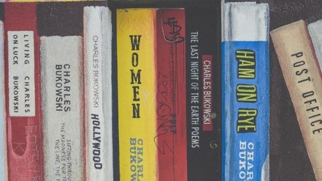
Recently, whilst looking for inspiration for a graphic design exercise for students, I thought about the visual impact that book covers can have on consumers’ reading habits. We don’t really think too much about the changing trends in book cover design – but like all trends – they come and go often without us knowing how far they have infiltrated into our visual psyche.
I used designhill.com to review some of these trends.
Trend 1: Bold Typography– design wants us to connect immediately with type. We need to know at a glance what is written on the book cover. Curly cursive or very old-school gothic style type is a form of SERIF typography, referring to the little extra stroke found at the end of the main vertical and horizontal strokes of some letterforms.Some are subtle and others may be quite pronounced and obvious). Clean and contemporary typefaces are most often SANS SERIF, literally meaning without serif – this form of font is easily read and draws the reader to the words without any letterform distraction. CAPITALISED FONTS are big news – they ‘announce’ themselves to the reader. They are statement-making.
Trend 2: Minimalism in Design – this approach directs the reader’s attention to one primary focus, without fussy distractions or over-decoration. So, one colour might fill the book cover, or discreet, but clean font details the title and author with little distinction in type between the two. The core content of the book might be encapsulated in one well-chosen image, or detail, while the rest of the cover uses white as a void. There’s no visual confusion with this style of cover.
Trend 3: A Hand-Made Aesthetic: hand-drawn lettering/images – the use of handwriting, used to connect the reader in an intimate and inclusive way is used with particular success in children’s book covers. It helps to draw a parallel between the author’s experience and that of the reader. The edginess of hand drawn images, coupled with handwriting is popular for mystery novels too – again, the combination establishes a visual narrative where the reader is encouraged to get involved.
Trend 4: Retro, Vintage and Old School – nostalgia is always on trend; but it is the era that morphs and changes with the times. Generally speaking, nostalgia looks back to one generation ago. So, we are currently seeing the 1970s and 80s getting the retro treatment in book cover design. Fonts are becoming more rounded and organic (the 70s); colours are tending towards bold neon-inspired riffs on 80s popular culture.
Trend 5: Collage Elements – this trend goes hand-in-hand with the retro and old school vibe. Collage connects us to the real world – elements like pattern, texture and colour can be specifically directed to forms to suggest other worlds, or experiences that help to tell a visual story. Collaged elements can stimulate memories or half-forgotten associations. Collage can help to direct our attention to content or ideas as a form of visual short cut for the reader. Generally, collaged covers are more experimental. Designers feel free to use collaged images from a grab bag of contexts, establishing new settings, environments and concepts.
Trend 6: Authentic Photography – this refers to ‘real’ photographs taken from life situations, as opposed to studio shots, stock photos or invented images. Connections are made stronger if we believe that we could be these people; or we could visit these places; or we have known this experience. These photographs deal in feelings – we are emotionally connected to the story from the get-go.
Trend 7: Think Pink! – Just like nostalgia, pink never really goes far away. Millennial pink is still with us. It has a strange fascination in that pink, in the 21stcentury is oddly genderless. It’s not lollipop, and it’s not granny twin set. It’s a flattish, slightly greyed-off pink that’s like a faded blush. Book covers look good in it!
Trend 8: Scatter Design – Even though minimalism is a strong contender for top design direction, there is a parallel movement where overall scattered design creates an integrated surface with the typography – it’s all one big free-wheeling design. Readers find that these covers are memorable, and designers know that the reader loves to spend time delving into this form of cover design. It becomes part of the discovery experience of the book, and usually runs parallel to a complex interwoven narrative.
Trend 9: Text Overlay – Typography is placed directly over an image – sometimes it’s a bold statement, sometimes it’s almost woven into the image – this can assist to bond the text and image as one in the reader’s mind. It’s a strong statement that commits the reader to the narrative.
So, what can we do with these trends as a design exercise?
How about trying out two book cover designs that use some of the trends above? Beware – it’s always better to select one or two principle trends, and then support then with other design elements within the cover design. This way, you’re guaranteed greater visual cohesion.
Try the following design brief and see how you go.
DESIGN BRIEF: To design two young adult novel book covers that reflect the same title and author, but two different scenarios.
1. Scenario one:
Novel title: No
Novel author: V. V. Smythe
Genre: Adventure/Mystery set some time in the future
2. Scenario two:
Novel title: No!
Novel author: E. L. Smythe
Genre: A Comedy of Errors about mistaken identities, set in the past
This is your opportunity to consider how the two title narratives might play out differently. What difference does the exclamation mark make to the storyline in scenario two? Is this narrative lighter and full of comedic moments? What identities should be highlighted in the cover design? Should we feel a sense of happy fast-paced confusion through the visual design?
How could the bold No of scenario one take us on a mysterious journey into the future? Who are the adventurers? Where are they going? What might they be seeking? Why is the statement No important to the context of the story? Is this story dark and tense?
Select a different principle trend for each cover.
When designing, look at the proportions of novel book covers, and design within these parameters. You can design to a bigger scale but keep the proportion consistent. Think about typography options, the use of positive and negative spaces within the design, the visual ways that narratives are told and the integration of your text and image(s).
This is a great design exercise for giving you scope to experiment with your style, within the constraints of the brief. Be prepared to trial options; don’t settle until you’re sure that these covers will guarantee that the books walk off the shelves!
Wendy Muir
Art Eye Deer Teacher
