
Art Terminology Explained: Key Terms for Students and Educators
Jul 17, 2019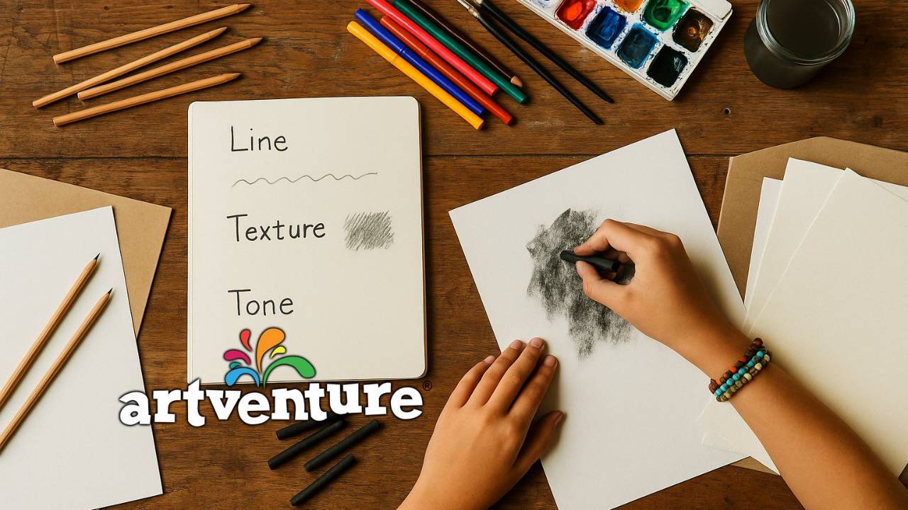
Art Terminology Explained
Why Understanding Art Terms Matters
In almost every ArtEyeDeer lesson we use art terminology that helps us, as your presenter, to categorise concepts, styles, approaches, techniques and processes. Sometimes the terms are self-evident, and at other times their meaning may not be quite so clear to you as you watch the ArtEyeDeer lesson. If you’re really interested in the visual arts, the language used to describe aspects of making is important. It’s like a language that belongs specifically to the Art Tribe, of which you are one!
We suggest that you save this terminology list and use it frequently to dip in and out of, as you encounter terminologies that are either new to you, or that you want to review for greater clarification or understanding of its context in the world of artistic expression.
Where possible, the terminologies are described in ways that you will encounter them in the ArtEyeDeer lessons.
Glossary of Common Art Terms:
Abstract: The most accessible way to think about what is abstract, is to think of its opposite, which is realism. In our ArtEyeDeer lessons, we refer to an artwork as abstract when it meets one of two criteria: it can be based on something that is real, or from the real world, but the way that we interpret it tends to remove most of the “visual signposts” that help to identify it as “real”, or “realistic”; or, we begin by having little or no basis for realism when making the artwork. When this occurs, another way of saying that it’s abstract, is to use the term “non-objective”. Colour, shape, pattern, and lines can make up the formal composition of this kind of abstract artwork.
Aerial perspective: When we create an artwork where it appears that we are looking down from above, we are applying a form of aerial perspective. Think what its like to look down from a height – from an aeroplane window, a scenic lookout, the top story of a tower building, and imagine the way that this viewpoint can flatten the perspective of what you see below, turning the view into a series of patterns or grids. So many highly imaginative drawings and paintings can be made this way because your viewpoint has been altered through the change in your visual perspective.
Aesthetic: This is probably the most frequently used terminology in our lessons. It’s one word that can say and describe so much. It’s a word that is associated with beauty – but it doesn’t necessarily mean that an artwork must be conventionally beautiful to be “aesthetic”. In a broader sense, the word helps to describe a response that isn’t about the artwork being useful, or topical, political, scientific, or emotional – it is primarily about its visual appeal to you as the artist, and to your audience as the viewer. It is a visual way of arresting your attention.
Analogous colours: Colours that are closely related, or next to/near each other on the colour wheel (blue, blue-green, green). These are also the colour relationships we can often associate with a natural phenomenon – think of the analogous colours of Autumn (Fall) – yellow, yellow-orange, orange-red, red-brown. When analogous colours are applied to a drawing or painting, the colours are often considered as harmonious because their relationship to each other is so close and visually coherent.
Chiaroscuro: One of the best art words ever! It’s a great one to say out loud (ke-ära-skooro). Chiaroscuro refers to the action of drawing or painting forms where the consideration of how light plays over these forms is important. It is the contrast and balance of light and dark that helps to create the illusion of depth and space in a composition. It is very important in portraiture, figure studies and still life if you want to achieve a sense of modelled form. The artists Rembrandt and Vermeer were masters of this form of modelling with light and its opposite, darkness. Study their drawings and paintings – it’s worth it, as their artworks are the key to understanding how important light is to form.
Chromatic colour / chromatic greys: when two complementary colours are mixed together, they produce a neutral chromatic grey colour. This is not a “grey” in the sense of our understanding of white + black = grey. It is a whole range of “muddy” desaturated colours. These colours are essential if you want lots of subtle tonal contrasts in your drawings or paintings that are made with colour mixes. Chromatic greys are very rich in depth – they can take some getting used to because your first reaction to them might just be “yuck”. But be persistent, find ways to use them – for instance, when drawing or painting a lemon (an ArtEyeDeer lesson), the range of yellowish tones in the shadow areas of the lemon which can be made by combining different colour values of yellow and purple, will really help your lemon image to model a three-dimensional form.
Collage: a technique where a variety of small surface pieces or fragments are combined in composition by pasting over a common surface. There is a genuine art to collaging when it is associated with fine art – the fragments you use need to have commonalities of colour, pattern or texture to help them to come together as a harmonious surface. Sometimes, too much can be too much!! The assemblage of all these fragments needs to be considered carefully – move pieces around, add and subtract pieces continually, before you make the final decision to glue them down. Even if the collage is going to be drawn or painted over, it should be visually cohesive in its own right, before any other media is then applied to it.
Colour value: is the relative lightness or darkness of a colour, which when applied in a drawing of painting, helps to define form and describe the illusion of dimensionality and space in a composition.
Complementary colours: Hues directly opposite one another on the colour wheel that are as different from one another as possible. When placed side by side, complementary colours are intensified because the unique light absorbing and reflecting qualities of each play against each other. When you want to create contrast with colour, this is an excellent way to achieve a vivid and vibrating pulsing of colour.
Composition: The organisation, design or placement of the individual elements in an artwork. Composition is the framework of the artwork. It’s important to get this right visually in terms of proportion and balance before developing other aspects of the artwork.
Contour: A line, or series of lines, that creates a boundary separating an area of space from the space around it. An object, figure or portrait can be described by using contour lines where the lines form and describe the shape of the object. A more relaxed version of the contour line is used when we employ continuous linein a drawing, remembering that in continuous line drawings we keep the drawing tool in contact with the surface at all times. This is a great way to train your eye to move over an object, searching for the essential contours that describe the object, figure or image. ArtEyeDeer loves continuous line!
Cropping: This is the removal of areas of an image that you no longer want to consider as part of a composition. This is done to enhance the visual impact by creating a stronger, and often more compelling composition. We will often suggest the cropping of a photographic image to create a different compositional viewpoint, begore using this new composition to create an artwork.
Cross-hatching: This is a way to model form in a drawing where short diagonal lines in one direction, cross at right angles with another series of short diagonal lines. It can be a quick, loose process, or it can be used with great care to define the tonal form of an object or figure. It is a technique that ArtEyeDeer loves because of its drawing versatility.
Design: Design involves both function and aesthetics.It is hard for one to exist without the other. When you’re “designing”, even in the early phases, you’re always conscious of how something might work first, and then, how it might look. Designers understand this by using the phrase “form follows function”. Design in art can also be used to mean a decorative pattern, or preliminary composition. The way you use the word “design” in a sentence helps to give it context.
Desaturated colour: One way to aesthetically suggest the vividness of a colour, is to place it next to a desaturated colour. Desaturated means that the colour has been “dulled” by mixing. Chromatic greys are desaturated colours – valuable for describing darker tonal areas or shadows in an artwork.
Distortion: When you pull, contort, or exaggerate a figurative aspect of your drawing or painting, you are altering its shape or form. This is a valuable process to apply if you are looking for ways to abstract an image. The more you distort, the more you will alter the aesthetic representation of an object or figure within the space or composition you’ve created. There’s so much freedom of interpretation made possible through distortion.
Dynamic: This is a word that is used often when ArtEyeDeer presenters are discussing composition. It refers to your composition being active, where you as the artist has been instrumental in evolving your composition to a point where there is a great deal of visual activity apparent in the artwork. Your eye works hard to move in and out, through and around the composition. Colour can also contribute to the dynamism of the artwork.
Expressive: ArtEyeDeer presentersoften discuss the“expressive” qualities in an artwork – we may be referring to the linework, or the colour, or the subject matter. This word is most often associated with feelings and emotions and the way that our artistic sensitivities can alter the representation of a line, colour or subject. To be expressive can be for some artists, the most important aspect of their practice, because it signifies their individuality.
Fixative: This is anartist’s fixing medium, usually a quick drying spray applied over any dry or wet media to prevent it from smudging or shifting. Very useful for charcoal, soft pastel, graphite, coloured pencil and watercolour. Inexpensive hairspray will do the same trick. Once an artwork is fixed, it can be worked back into again without the layer beneath being altered. Mixed media works benefit greatly from this process if fixing and reworking. Always spray lightly from a 15cm distance, working horizontally across the artwork first, then when dry, work vertically across the artwork. This forms a good lattice protection on the surface of your artwork.
Focal point: In an artwork, the focal point forms the centre of interest – it is the position where your eye comes to rest, after moving through the composition. The key aspect that you will notice the ArtEyeDeer presenters emphasising, is that your focal point should never be placed in the centre of your composition. If it is in the centre, the eye fails to move away from this point. It is much better for your viewer’s eye to work to find the focal point. Think about positioning it to the upper left of centre, or lower right. You can use colour contrasts to create a focal point, or a shift in light or tone, or by applying a variation in technique.
Foreshortening: This is a technique that is particularly valuable when drawing or painting the figure. It’s used to create the illusion of a part of the body receding away from the viewer, by making it appear shorter than it is in real life, so that it seems as if it is compressed by distance. Think about a hand thrust forward on an arm, where to the viewer’s eye, the arm appears very short because the perspective or viewpoint has foreshortened the arm. Figures in action are often depicted using foreshortening.
Form:InArtEyeDeer lessons, the word “form” can often be interchangeable with shape. It helps to think that the “form” is the bringing together of all the parts to create the resolved image, or object, or figure.
Genre: Painting can be described as a genre in art. The word “genre” helps us to categorise or classify something according to a set of characteristics. There can be sub-genres within genres – for instance, watercolour is a sub-genre of painting. Nature is a genre because we can identify and classify characteristics of the natural world.
Geometric: We discussthe word “geometric” most often in ArtEyeDeer lessons in relation to shapes. Patterns can be geometric, employing straight lines and/or regular shapes – this is known as flat geometry.
Glaze: We refer to “glazing” as a technique in painting. This is a thin, transparent wash or film of colour that forms a layer over the top of an opaque underpainting. Light travels through the transparent glaze and reflects off of the opaque layer underneath, creating a beautiful luminosity of colour and light.
Gouache: An opaque watercolour paint, designed to be used when you want to achieve an opaque flat surface treatment.
Ground: This termrefers to the background surface that you then draw or paint over. It is most often an all-over coating; it can be evenly applied, or it can be rough and intermittent, depending on the visual and textural qualities you’re after. The ground can also be opaque, so that it is dense enough that you don’t see the surface below, or it can be semi-transparent. In whichever way you decide to apply it, the idea is that it becomes the foundation surface of the drawing or painting. Watercolour, acrylic paint and drawing ink can all be used to create a ground on paper.
Hatching: A technique of modelling, indicating tone and suggesting light and shade in drawing or tempera painting, using closely set parallel lines.
Hue: is another term for colour. It best describes the pure spectrum colours of the colour wheel – those colours we describe as red, orange, yellow, blue, green, and so on.
Harmony: We often strive to createa harmonious composition in an artwork. What must we do to achieve this? E We need to create a sense of unity of all the visual elements of the composition through using repetition of the same characteristics. This might be achieved through use of colour, or shape, or line work, or any other characteristic that is essential to the formation of the artwork.
Impasto: A thick, juicy application of paint to canvas or other support where the emphasis is on the physical texture of the surface. You would not use this technique if you required a smooth, flat surface.
Impressionistic: The changing effects of light and colour are primary to an understanding of an impressionistic technique. As the artist, you would concentrate on developing your compositional image by using a combination of short layered brush strokes and thick impasto applications of paint. The same impressionistic effect could be achieved on paper using coloured marker pens.
Intensity: When using colour,it’s important to understand how the degree of brilliance or purity of colour can impact an image. Vivid, pure colour is also known as saturated colour. The three primary colours are the most intensely saturated colour there is.
Linear perspective: A method of depicting three-dimensional depth on a flat or two-dimensional surface. Linear perspective has two rules to apply: 1. Forms that are meant to be perceived as far away from the viewer are made smaller than those meant to be seen as close 2. Parallel lines receding into the distance converge at a point on the horizon line known as the vanishing point. ArtEyeDeer presents lessons where you have the opportunity to practise linear perspective. Once you understand the rules, you can then experiment with breaking them to alter the illusion of perspective!
Medium: “Medium”can be used in three ways: it can describe the material used to create an artwork, or it identifies the binder for a paint, such as oil or water. It can also delineate an expressive art form, such as painting, drawing, or sculpture.
Media: We use this term in ArtEyeDeer to specify the use of more than one medium (material) used in the creation of an artwork. For instance, when watercolour and coloured pencil are used together in an artwork – we would say that the “media” is watercolour and coloured pencil.
Minimal: The art elements are rendered with a minimum of lines, shapes, and/or colour. The artwork may look and feel sparse, spare, restricted or empty. The use of space (both positive and negative) becomes of primary importance in a minimalist composition.
Mixed Media: An artwork that is created using the combination of more than one medium. The important word here, is “combination”. Artists become very skilful in integrating various individual mediums to resolve both the aesthetic quality and physical surface of the artwork. Wet and dry media can be combined in a mixed media work.
Modelling: In drawing, painting, or printmaking, the illusion of three-dimensionality on a flat surface can be created by replicating effects of light and shadow through using tonal shifts so that they follow the form of the object or figure. The aim of a modelled form is to suggest the illusion of reality.
Modulated line or tone: As an artist, you are in charge of modulating the way you scale your line or tone. With line, you might use lines that are thick or thin. You may describe the contours or outlines of an object or figure with lines that gradually modulate from thick to thin. This assists you to create variation in the profile of a form. To model a form using tone, you might apply a graduation from light to dark, to characterise the movement of light to shadow over a surface.
Monochromatic: Using only one colour, with variations of value and intensity of that colour, often, but not exclusively with the addition of black and/or white to the one colour to create tints and shades of that one colour.
Monotype: A unique print made by painting on a sheet of glass, or thick acetate pastic, and transferring the still-wet painting to a sheet of paper held firmly by rubbing the back of the paper with a smooth implement, such as a large spoon. ArtEyeDeer lessons also demonstrate a very accessible alternative monoprinting technique using oil pastels on paper.
Narrative: An artwork created where a story serves as a dominant feature. It can be a developed through the characters portrayed, or more compellingly, through the use of viewpoint and composition, as the Australian Indigenous and Torres Strait Islander peoples have demonstrated in their cultural dreaming practices since the dawn of the Dreamtime.
Naturalistic:this term describes the visual qualities of an artwork that closely resembles forms as we know them in the natural world.
Negative space: The space in an artwork around objects or figures that helps to define their shape within a composition.
Organic: An image or process that shows a relationship to nature as opposed to being man-made. A shape that resembles a naturally occurring form. When an artist creates an artwork that grows naturally from an idea, without following any structured process, the process can also be referred to as organic. In ArtEyeeDeer lessons, we use either interpretation of the word when it is appropriate to the development of the artwork lesson.
Painterly: This is a word we like to use in our ArtEyeDeer lessons in relation to paint techniques because it helps us to describe both the way paint can be applied by the artist, and the way it is perceived by the viewer. It encompasses consideration of colour and texture application that isn’t defined by lines or hard edges. The artist’s brushstrokes are well defined and an important part of the artwork’s visual and technical creation.
Perspective: The technique of representing three-dimensional objects on a two-dimensional surface. This technique is used by artists to suggest the correct impression of height, width, depth, dimension, and position of one object in relation to another within compositional space. In one-point perspective, all parallel lines in a composition converge at a single vanishing point on the horizon. In aerial or atmospheric perspective, the relative distance of objects is indicated by gradations of tone and colour and by variations in the clarity and modulation of outlines. There are ArtEyeDeer lessons that explain some of these complex principles very clearly.
Pictorial space: The illusion of space in a two-dimensional artwork that seems to recede backward into depth from the picture plane, giving the illusion of distance. This is an essential technique particularly for landscape artworks to differentiate between foreground, middle ground and background to understanding the depiction of distance.
Picture plane: An imaginary flat surface in a drawing or painting which suggests that behind the picture plane is a deep three-dimensional space. The picture plane is often associated with the foreground of a painting. It’s a complicated concept, but one that becomes easier to understand as more painting processes, techniques and compositions are practised. Think of still life artworks where a table with objects on it occupies the foreground of the composition – this is the picture plane.
Pigment: A powered colouring substance that can be found in natural earth-based materials, or synthetically man-made. When mixed with liquid binders it becomes paint, ink or other dry drawing media.
Photorealism: A painting and drawing style used to depict figures, objects and scenes with a high degree of detailed naturalism, so that the artwork resembles a photograph in its exacting pictorial accuracy.
Positive space: The space in an artwork occupied by the object or figure depicted. The in-between, background or external spaces occupy negative space.
Proportion: Size relationships between parts of an object or figure, or between two or more objects or figures helps viewers to understand interactions of scale in a two-dimensional artwork.
Realism: Any art in which the goal is to portray forms in the natural world in a highly representational manner. Specifically, an art style of the mid 19th century, which fostered the idea that everyday people and events are worthy subjects for important art.
Render: You may hear us describe drawing as “rendering”. This is the whole process you use to create your drawing – it encompasses you formulating the image or object through drawing and outline, then utilising techniques to add tone through shading, as well as colour and/or texture where it is required. In essence, it’s the package of drawing. The word can often be used as an expression too, such as, “to render the tone carefully”.
Representational: Works of art that are depictive of forms in both the natural world and man-made world.In ArtEyeDeer lessons, the presenters interpret “representational” by associating it with artistic interpretations that refer to realism, without rendering the composition with absolute realist accuracy.
Saturated colour: The purity or intensity of a colour, where the colour is its most vivid and visually penetrating.
Scale: Scale needs to be considered in relation to proportion. It is a form of measurement that helps the artist or designer understand relationships of size between objects, figures and forms.
Still life: A painting or other two-dimensional work in which the subject matter is an arrangement of objects – fruit, flowers, tableware, pottery, and so forth – brought together for their pleasing contrasts of shape, colour, and texture. The arrangement by the artist is essential to the aesthetic success of a still life composition. A still-life will always refer to real objects but may not necessarily be depicted realistically. ArtEyeDeer lessons explore a range of different ways that still life can be interpreted and depicted.
Stippling: A pattern of closely spaced dots or small marks used to create a sense of three-dimensionality on a flat surface, especially in drawing and painting. Stippling is a tonal technique that can achieve the same kind of modelled form as hatching, cross-hatching.
Style: A characteristic, or a number of characteristics that help to define an artist, art movement, or artistic cultural practice as synonymous, or identifiable with them or it.
Stylised: Illustrative of artwork based on forms in the natural world that undergo creative or imaginative transformation through introducing elements of simplification or distortion for purposes of design.
Support: The surface on which a work of two-dimensional art is made – like canvas, paper, cardboard, or wood.
Symbol: Symbols are important emblems of meaning in every culture across time. A symbol is an image or sign that represents something significant, often in a stylised way, and is associated with some form of convention or resemblance.
Texture: The actual feel (roughness or smoothness) of a surface. In art, texture may refer to the illusion of roughness or smoothness, or it can tactile as a real physical surface.
Tonality: The overall colour effect in terms of light and dark values. Often, this tonality can be gradually graded from a light to dark value, or vice versa.
Underpainting: The traditional stage in painting of using a specific colour palette as a base for a composition. Once dry, the artist can then apply a range of colours (often contrasting) over the top, allowing the underpainting to show through in some places for artistic effect.
Value: The relative lightness or darkness of a hue (colour), or of a neutral varying from white to black.
Vanishing point: In linear perspective, the point on the horizon line where parallel lines appear to converge. Always useful to practise, especially when considering drawing or painting buildings in relation to street compositions.
Volume: Two definitions are applicable:a three-dimensional form implying mass, density, and weight; but also, a void or empty, enclosed space – like the inside of a sphere or cube.
Wash: Used particularly in relation to watercolour painting, or with diluted gouache, ink, acrylic or oil paint, to describe a broad thin layer of diluted pigment.
And there you have it – a list of terminologies that you can use like an artistic lolly bag – dip in and out of the list, when you feel the need for an art terminology bite or two!
Wendy Muir
Art Eye Deer Teacher
